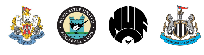
This looks what is set to happen with the new Newcastle United club crest
Earlier this year, as a member I was consulted through a survey about changing the Newcastle United club crest.
“Updating our club crest together” was the club line.
This may have seemed low down on many supporters list of wants or needs for their club.
The new stadium and access to tickets I believe is, or should be, top of everyone’s list.
However, as a student of design, football club badges have intrigued me for a long time, just as many other football related design does, whether strips programmes or stadia.
The survey presented three options – refine, revive, or reinvent. A line that countless businesses across the globe will consider as variables in their attempt to increase revenue.
Back in the early Nineties I had a Macintosh LC 2 Personal Computer. Cutting edge technology at the time with a full colour monitor, the word Macintosh alongside a little logo of a multi coloured apple with a bite taken out of it. An image that very few people took note of at the time.
Roll on the years and the word Macintosh is now Mac, however, most people will just refer to the company as Apple. I am typing this on my MacBook which is matt black with a shiny black apple logo. No need for any lettering just a simple image of black on black but what people would now refer to as iconic.
So what about football badges?
Many were based on medieval coats of arms that represented their cities. Newcastle United club crest being no different.
Some have developed over time but Newcastle went for the reinvent option in the seventies, eighties and nineties, and we are now with a club badge that according to the survey is not digitally compatible, as it is too complex and difficult to reproduce.
Other clubs are aware of this notion and have started to refine their designs.
Liverpool now have two club crests. The simplified Liver Bird for the global market and the traditional image in the form of a badge.
Other clubs in the Premier League are aware of this and have started to refine their club badges.
Man U have taken the step of ditching their badge for the away strip and training kit and simply having the red devil with trident logo, following business instincts.
Juventus, who are the Manchester United of Italy, in 2017 drastically re-invented their badge that had developed over a century, but varied little from its initial concept. The Juve logo was refined again to be more compatible with the digital age.
The design trajectory of the club badge and the importance of it in the modern football world is obvious.
Much as I dislike Nottingham Forest, they appear to have been ahead of the curve with their stylised forest logo (I suspect purely by chance and not planned).
I expect a new logo for Newcastle United at some point and I believe it will simply be a new castle.
If you would like to feature on The Mag, submit your article to contribute@themag.co.uk